Color and paint from still life

12 04 2012

I can teach you how to paint!

While my art students are on a little break from class—they’re vacationing in Turkey!—I’ve decided to show you what we’ve done so far in Painting I. Each week I welcome students with a studio tabletop set-up, explain the lesson, and do the lesson with them. We paint these assignments after practicing basic drawing and perspective, and learning about the values of light.

I urge students to not paint from a photograph, preferring that they draw and paint from life and the “local color” cues they should put down in the beginning. However, the now-ubiquitous digital camera phone and that the set is not available for viewing once the class is over for the day make it difficult to not refer to a photo.

The problem is, for beginners especially, if you paint from a photograph, the painting will look like a photograph. I think a painting is more interesting when it shows the artist’s individual line, imperfections included. Looseness will develop with time.

Below you can see how I treated the assignments myself. The medium is oil paint on canvas paper. Here’s evidence that limited palette paintings are generally stronger than images created with a full palette. Still to come, after students come back from break: the red-green painting and complementary color lesson and “the world in full color.”

Copyright 2012 Rebekah Luke
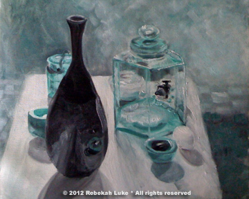
The painting. Monochromatic color lesson: adding one hue only, veridian, to black and white, still mindful of the range of values, that is, the various tints and shades of gray. Lesson includes painting glass.

The set. Analogous color painting lesson with black, white, and three yellows. Black mixed with yellow makes green.
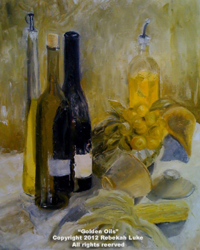
The painting. Using cadium yellow pale (cool yellow), cadmium yellow light (warm yellow), yellow ochre, black, and white.
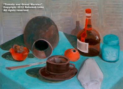
The painting. The combinations of mixing cadmium red light (red-orange) and veridian (blue-green) represent the first of four lessons about complementary colors, that is, colors that are opposite each other on the color wheel. Combining complementary colors produces neutrals that are stronger than tube paints named for earth tones.

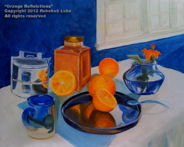
The set. Complementary colors blue and orange with shiny metal, glass, reflective surfaces, highlights (the incandescent spot) and low lights (from the window light).

The painting. Though challenging, it is much fun to paint reflected light.

The set. The complements yellow and violet mix to make warm tans and browns. Of light rays passing through a prism, yellow is the lightest value, and violet is the darkest. This still life set introduces drapery.
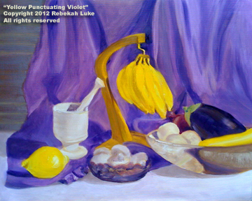
The painting. Painting drapes in the studio now is good practice for painting the Ko‘olau Mountains in the landscape later!

To learn more about painting lessons by Rebekah, please see the related post: Is painting on your bucket list?


A fresh look at the art of painting green

20 10 2010

Some painters claim they don’t know how to paint green. It must be why paintings of this hue are generally absent in the art galleries. In this post I’ll show how to paint green. With oil paint, the trick is to change your base color.

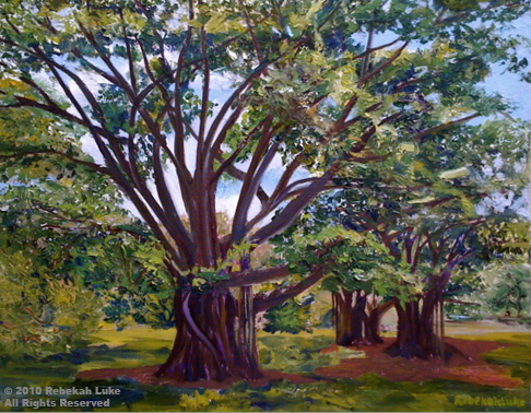
I love green. “Banyan in the Park” and “White Ginger,” two of my most recent paintings, are predominantly green. Looking at them gives me a feeling of calm, coolness, and serenity. More so, I can recall the satisfying experience of choosing the images and transferring them to canvas. I can smell the sweet scent of the ginger patch.

Banyan in the Park

White Ginger

Painting green is no secret, it’s a technique. As mentioned, it’s all about changing your base, your base being a yellow or a blue because yellow plus blue equals green. In the field, I still use a color chart I made when I took my first painting classes. Someday I’ll paint a new one!

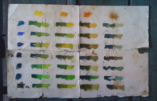
My green color chart on canvas paper, a bit ragged but still useful!

You can make a chart like this too. Use a palette knife. Put a swatch of each of your yellows in the top row. Down the left column, dab a swatch of each of your blues, including black if you use black. The greens in the body of the chart are the result of mixing a blue with a yellow. For each combination of the two colors, I have added white two times to get a “light,” “middle tone,” and “dark” of the same hue. See how many different greens there are!

When I am on location, I literally walk up to the object—e.g., a leaf—and find the swatch on my color chart that most closely matches it, eliminating any guess-work. If the object is in the distance, I hold up my palette knife—with paint on it—in the air in front the object and squint to see if the hue and value (lightness or darkness) match. When you paint a green scene, step back for a moment now and then. If it’s starting to look all the same, maybe it’s time to change your base to “find” another green.

Going a step further beyond the colors on the chart:

To lighten, “warm it in the light,” that is, add the next lighter yellow from your palette plus a little white. To darken, “cool it in the shade,” that is, add the next darker blue from your palette.

This technique of warming it in the light and cooling it in the shade is known as “analogous,” meaning to use the next color on the color wheel. In the way I paint, I prefer analogous to “complementary.” Adding the complement—the color opposite on the color wheel—to a color will also darken, but it will also appear comparatively chalky. Put another way, if I want to darken green, I add blue, not red.

If you are still with me ;-), here are a couple of exceptions.  When painting a landscape, colors become muted and lighter in value in the distance. In this case the painter would choose complements. Realize, also, that whenever you see gray, use the complement.

I learned these tips from my teachers Gloria Foss, Vicky Kula, and Peter Hayward who taught us how to turn the form and about the logic of light.

Thank you!

Copyright 2010 Rebekah Luke


%d bloggers like this: